

A Better Search Experience
Creating an enterprise search solution for the SEI

TIME FRAME: Ongoing | TEAM SIZE: 6 members | ROLE: UX Lead/Product Designer
BACKGROUND
The Google Search Appliance (GSA) was the SEI's current enterprise search solution. It searched various repositories including SEINet, the intranet, SharePoint, and the Internal Wiki.
Google decided to sunset the hardware-based GSA and focus their engineering efforts on cloud-based solutions that cannot be used at the SEI. As a result, we needed to implement a new enterprise search solution before the GSAs reached their end of life.
My Role
I was the lead product designer for what our team colloquially coined Search 2.0. I conducted everything from initial user research and secondary research to UI design and collaboration with our developers through implementation.
DISCOVERY
Understanding the Current User Experience
The first step was to evaluate and understand how our users experienced the current internal search.
The Journal Study
The first step was conducting an internal journal study. The study took place over the course of 3 weeks through voluntary signup from internal staff.
Those who signed up were informed that they would be asked to provide feedback daily.
The questions were as follows:
Where were you searching?
What exactly were you looking for?
What was your initial query or keyword(s)?
How satisfied were you with the quality of your initial results?
How satisfied were you with how long it took to find what you were searching for?
Tell us more about your search experience. Was anything frustrating? Did something work really well? Did something unexpected happen?
If you had a magic wand, what would you change about search?
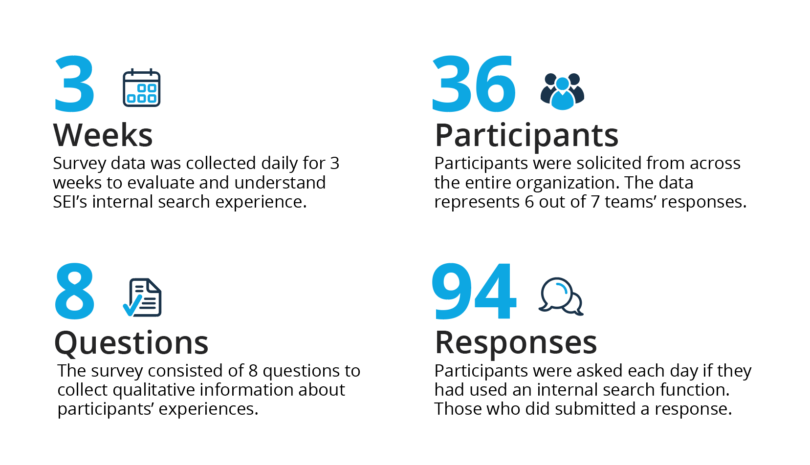
The Results at a Glance
Searches most frequently took place on SEINet — participants were allowed to designate multiple sites they used search. While 45 percent of participants were very satisfied with the quality of their initial results, 27 percent were very dissatisfied.


Those who were very dissatisfied or somewhat dissatisfied frequently changed their query or keywords to try and get better results. Of all participants, 47 percent either changed their initial query or gave up on the internal search entirely.
Qualitative Feedback
Comments from users are essential to understanding what they think about, want, and expect from a product. The first set of comments to the right are focused around new features that users want from our internal search; the second set is focused around comments users made about what happened during their actual search experience. By listening to feedback, we can improve the usability and overall experience for our users, and directly address specific concerns they have.
Feature Requests

Search Experience Feedback

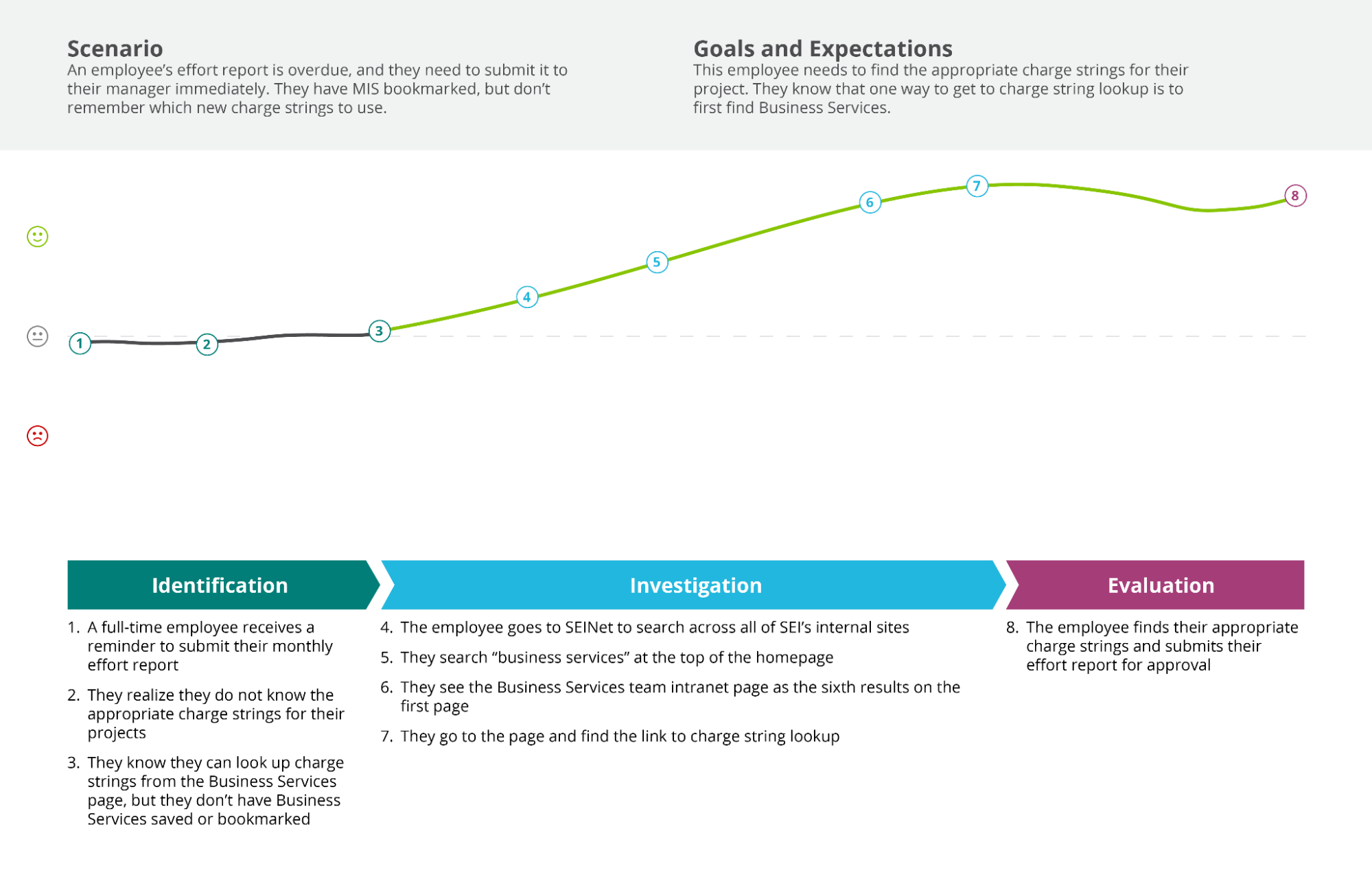
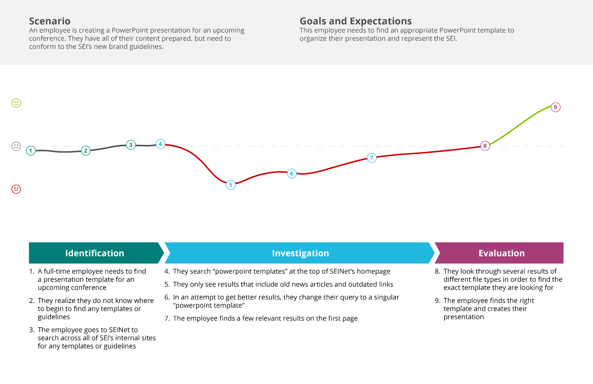
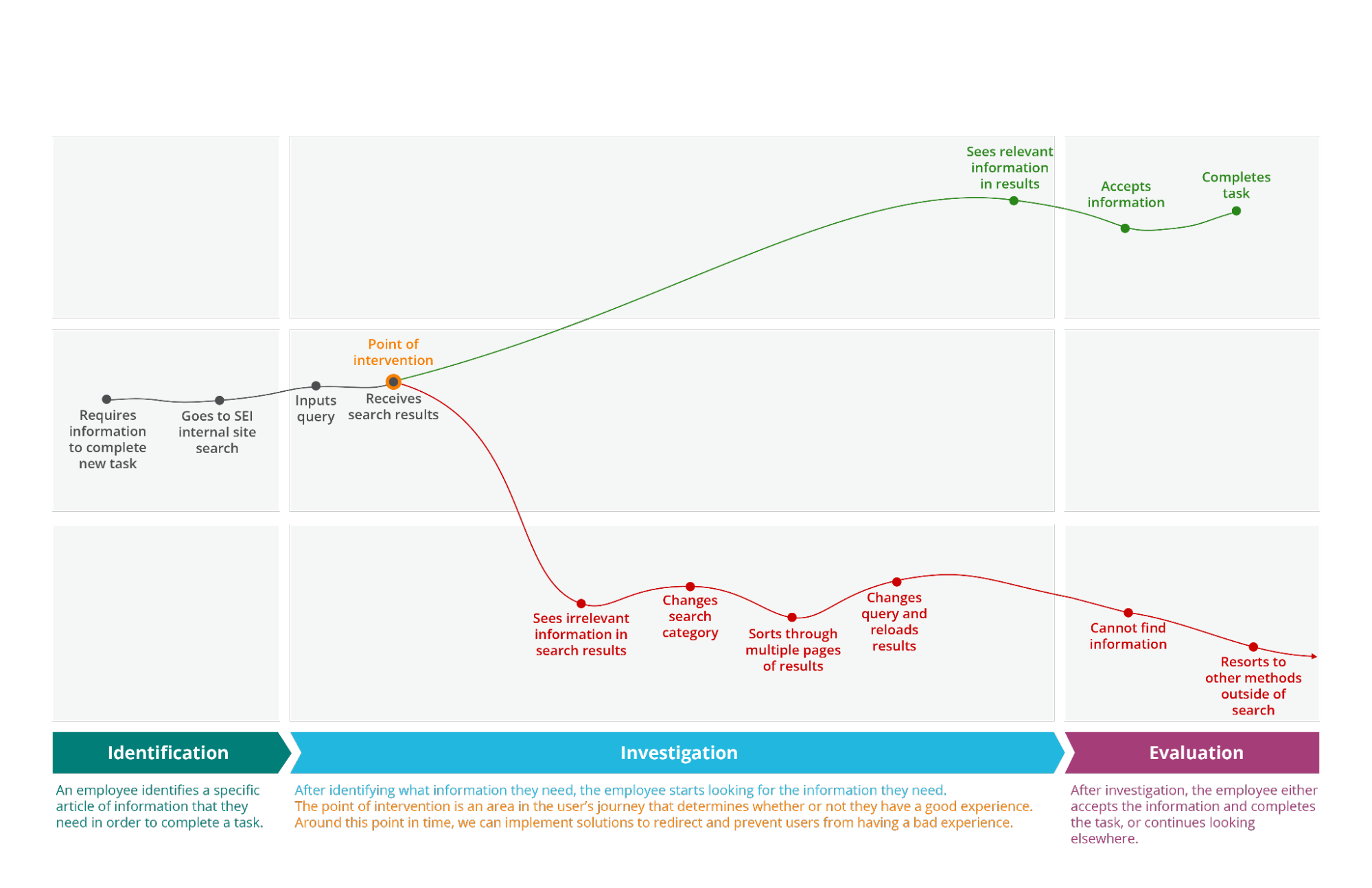
Users' search experiences can be categorized into three major types: an overall positive experience, a negative-to-positive experience, and an overall negative experience.
Below, you can follow the experience of each type of user in an example journey map, which lists and maps each step they complete in order to complete a task using search.
A user's search journey can be broken up into three phases:
Identification. The user identifies a task they need to complete and a piece of information they need to complete the task.
Investigation. The user looks for the information they need using internal tools and search, adapting their search queries as needed.
Evaluation. The user determines whether or not the search results meet their needs.

Mapping it out
Positive Experience
An overall positive experience means that the user quickly found what they were searching for with minimal, if any, difficulty. They found the information they needed with their first search query. 53 percent of our users had an overall positive experience when using search.
Negative-to-Positive Experience
A negative-to-positive experience means that the user did not initially find what they were searching for, but put in some effort to eventually complete their task. They might change their query after seeing poor initial results, or switch categories after realizing they were in the wrong section. Their initial negative experience thus ends on a positive note, since they found what they needed. 29 percent of our users had a negative-to-positive experience when using search.
Possible methods for intervention:
Allow filtering by document or file type
Suggest better search terms/queries
Have the option to organize results by date

Overall Negative Experience
An overall negative experience means that the user did not find what they were searching for. After multiple changes to their search terms, they give up on search entirely and resort to other means of obtaining information — e.g. asking someone in person, going to another website, or abandoning the task. 16 percent of our users had an overall negative experience when using search.
Possible methods for intervention:
Have a universal or advanced search option from the get go
Insights
Based on the data and analysis from the study, we've developed insights in order to prioritize features and plans of action in improving search:
The quality of a user's initial results determine whether or not the user has a good experience using search. As seen in the map to the right, a user's experience either becomes positive or negative after they receive their initial results. It can determine whether they have a great journey, or a horrible one.
Assisting a user in submitting the right initial query can reduce how long it takes for them to complete a task and greatly improve their experience. By intervening before a user receives initial search results, we can prevent user error and guide their journey to be more positive than negative.
Users have a high expectation for how internal search works. If the search results do not give them what they need on the first try, users tend to get frustrated because they expect a smarter tool with high functionality.
EXPLORATORY RESEARCH
As part of secondary research, we had acquired a copy of NNG’s Intranet Design Annual to learn more about how other intranets implemented and designed their searches. View the notes here as an image (sorry, it’s to avoid any easy copy-paste actions).
VISUAL DESIGN
Using our familiar SEINet style, I took a faceted approach that allowed users to have control both on desktop and mobile. Filters on the sidebar are specific to which facet the user is under (e.g. under People there are filters for job titles, office locations, etc.; under Pages & Docs there are filters for file types, authors, etc.).
NEXT STEPS
We’ve still got a long way to go with making SEINet search the best it could be. We have a good number of technical limitations and issues that arise from being a federal institution and not having access to the best backend systems to bring our users the content they may be looking for on the first try, but our search analytics show that:
More people are utilizing search
Users are finding what they need faster and exiting search typically in under a second
As SEINet continues to grow our search will have to adapt as needed, including accounting for different types of news, media, and information. It’ll be a challenge but…we’ve got it covered.