


Protecting New Zealand’s Native Freshwater Biodiversity
Creating a dashboard to visualize scientific data with the ultimate goal of pushing legislative action
TIME FRAME: 2 weeks | TEAM SIZE: 3 members | ROLE: UX Research + UI
The purpose of this project is to create a dashboard that displays climate change and biodiversity information that is relevant to New Zealand. Dashboards capture events as they occur, highlight critical situations, reveal trends, and ultimately help users identify threats and opportunities for action. Our dashboard focuses around New Zealand’s native freshwater species and the threats to the country’s freshwater biodiversity. It visualizes scientific data and events with the ultimate goal of pushing legislative action in an effort to conserve the country’s native species.
RESEARCH
Prior to creating sketches and wireframes, we researched New Zealand’s biodiversity and factors affecting its climate. We utilized news articles and data provided by the country’s government and conservation organizations to identify climate and biodiversity issues in addition to their critical threats. To begin our research, we started by looking at New Zealand’s biodiversity in general and narrowed down our focus based on our findings.
We also characterized each threat as largely stemming from global human activities, catchment based activities, human activity directly in the sea or stemming from a mixture of two or more of these.
We found the two top threats, 83% of the top six threats, 67% of the top twelve threats and over half of the twenty-six top threats fully, or in part, stemmed from human activities external to the marine environment itself.

Causes of species extinction
Based on the latest climate projections for New Zealand, by the end of this century we are likely to experience:
Higher temperatures – greater increases in the North Island than the South, with the greatest warming in the northeast (although the amount of warming in New Zealand is likely to be lower than the global average)
Rising Sea Levels
Frequent extreme weather events – such as droughts (especially in the east of New Zealand) and floods
Change in rainfall patterns – with increased summer rainfall in the north and east of the North Island and increased winter rainfall in many parts of the South Island.
IDEATION & SKETCHING
In addition to researching New Zealand’s biodiversity, we carefully considered different methods and forms of information visualization. We wanted the data to be easily understood by users while still conveying all factors we considered important to the issue of biodiversity. Furthermore, we wanted the visuals to be aesthetically pleasing without becoming tiring over time; since we knew that this dashboard would be in sight at almost all times, we wanted it to capture user attention without being too distracting.
In addition to past and predicted trends, one goal of our dashboard was to convey current events as they happen. Although animating the graphs and data might convey changes in real-time, we considered including a type of visualization that would show currently relevant events.
While researching news stories and articles, we found that critical events could be traced back to a geographical location that might be relevant to a policymaker who is watching a specific area, or an area that has been particularly affected by certain factors such as commercial fishing or water acidification. Based on this, we visualized tooltips on a map where each geographic marker conveyed information about an event (see image to the right).
Since the dashboard isn’t interactive in a sense that the user cannot directly manipulate visuals, we considered mapping events while coordinating information simultaneously in some of our final designs.
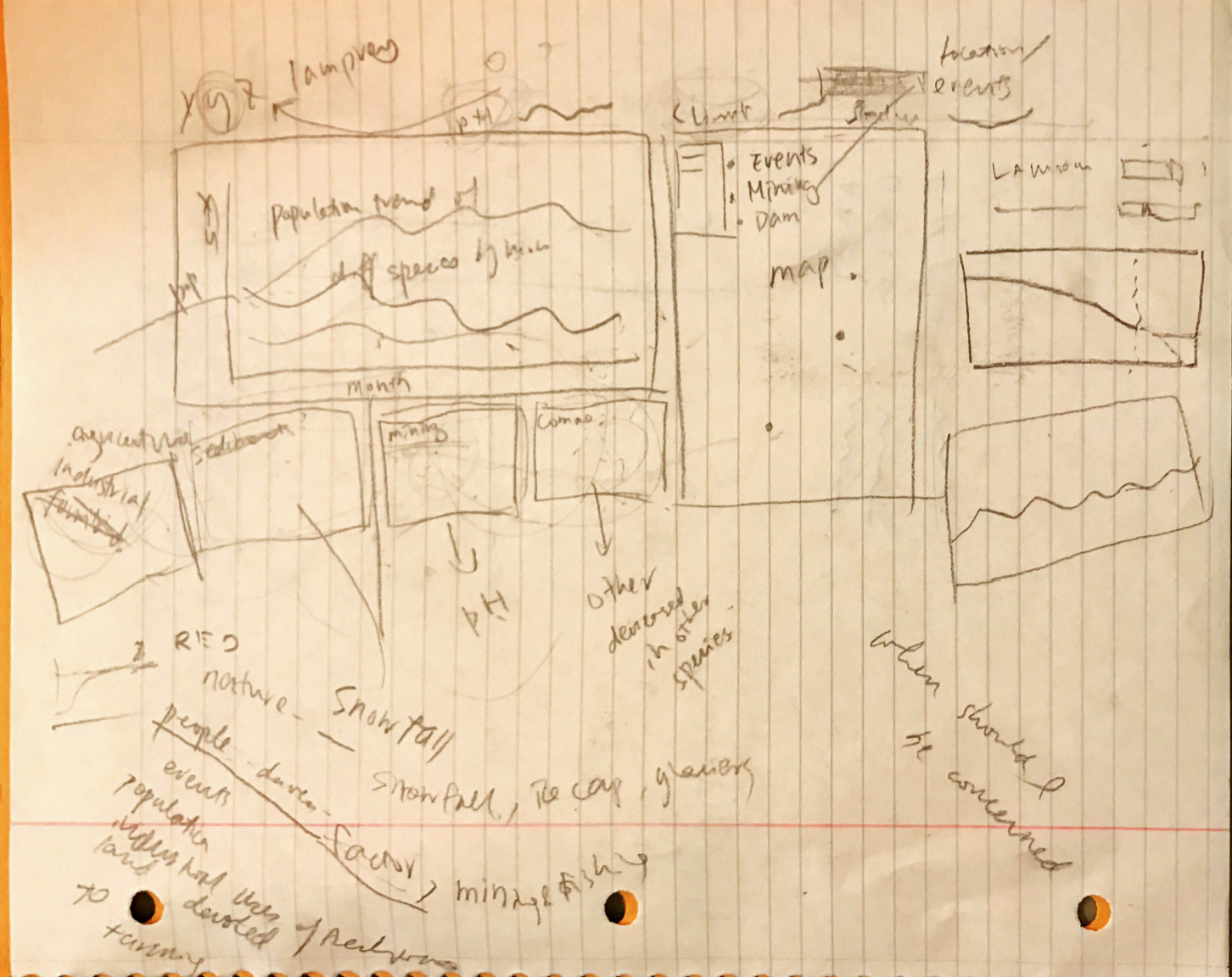
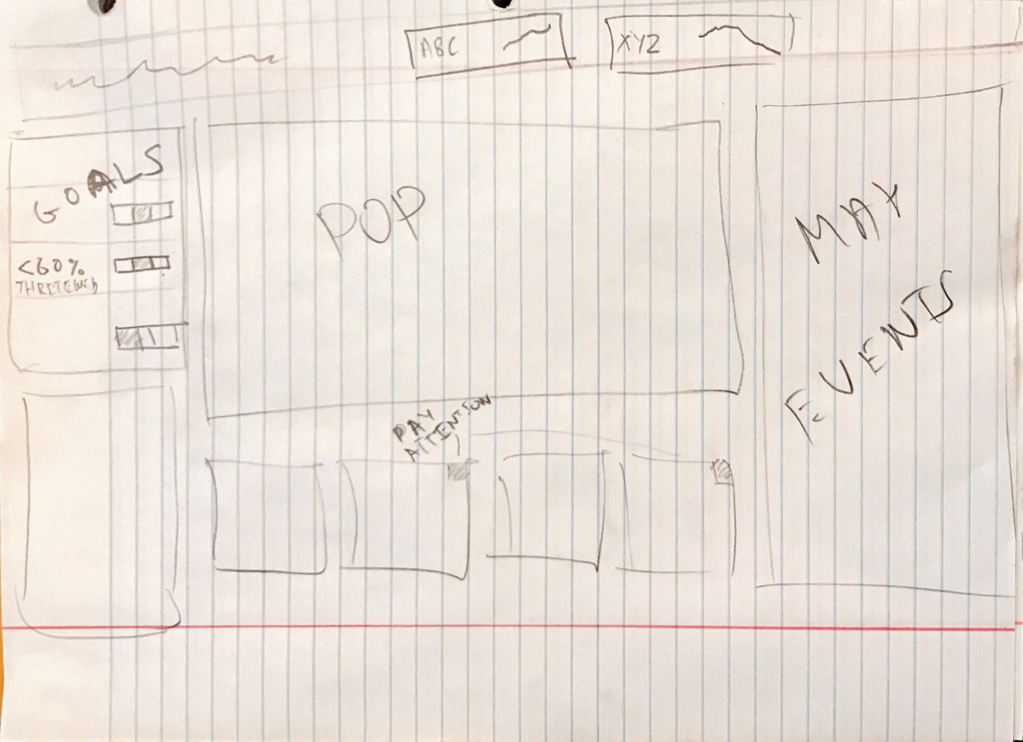
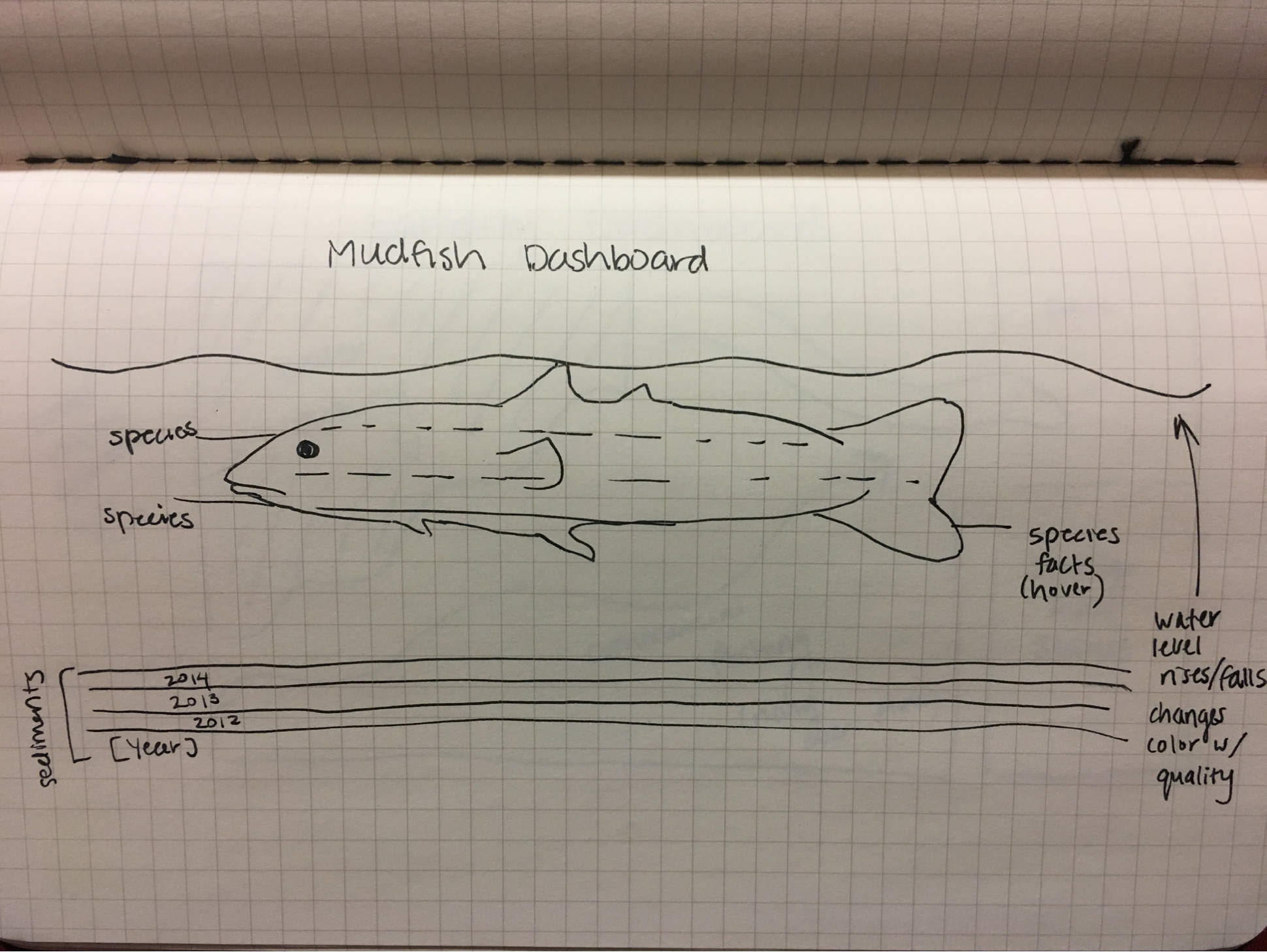
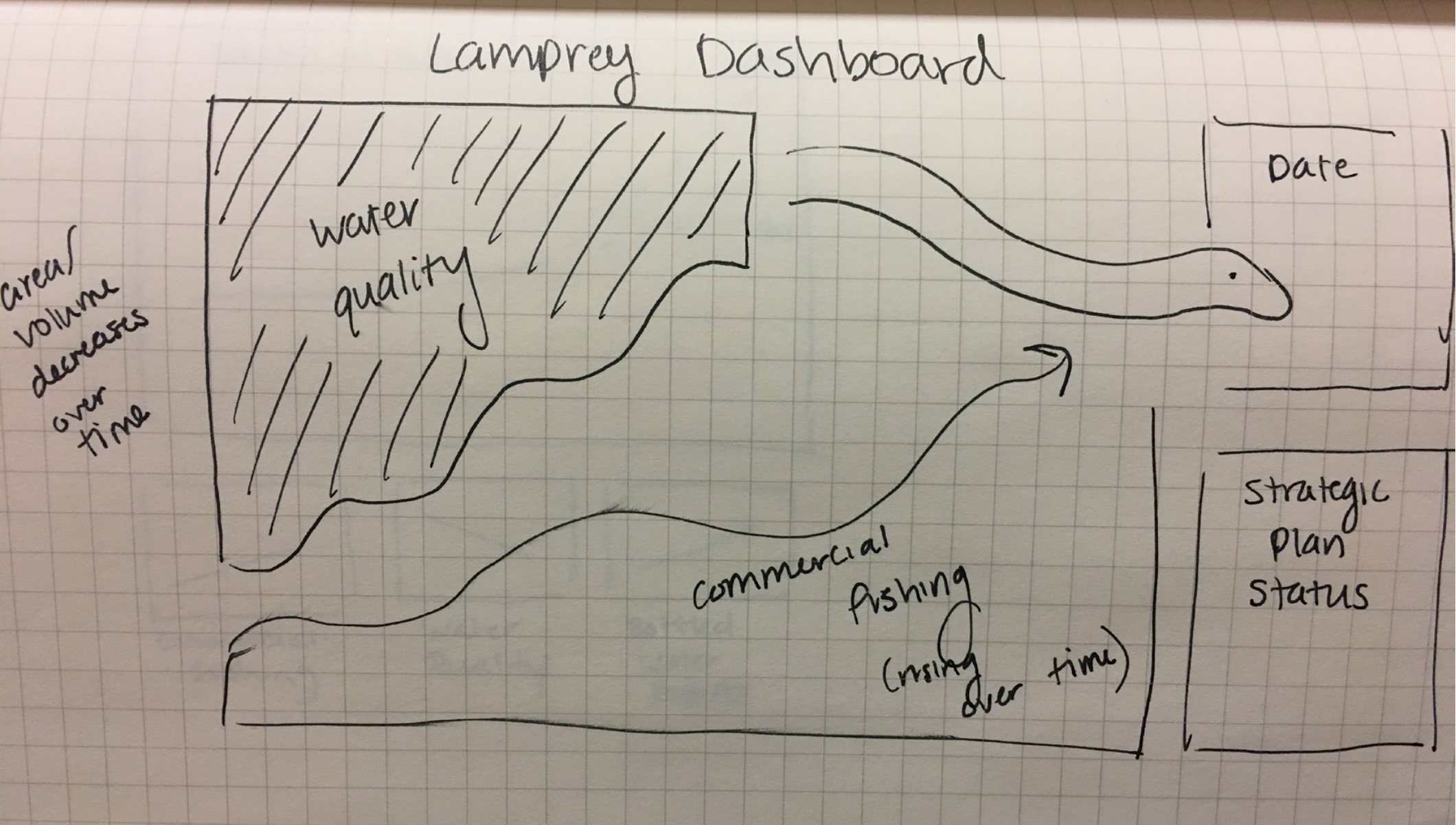
After researching potential biodiversity causes and issues we began to ideate and create sketches for a dashboard used by policymakers. We looked into specific endangered or at-risk freshwater species such as the lamprey and mudfish, as well as factors that affect quality of life and population in those species. Based on data and news events surrounding excessive bottled water exports, poorly controlled commercial fishing, and alarming water quality, we started sketching some ideas.
VISUAL DESIGN
The design of the dashboard is based on one principle: letting the data show above everything else.
To make sure we designed the right thing, we focused on:
Selecting the right display media
Using the right measurements
Determining the right information hierarchy
To make sure we designed things right, we focused on:
Visual impact
Micro and macro info
Balance between text & image
Color

The First Iteration
Pros:
Strong contrast in color
Highly visible number
Focus on visual graphic
Cons:
Missing key narrative and graph details

The Second Iteration
Pros:
Clearly defined layout
Highly visible number
Cons:
Green is a “nice” color and can be misleading
The graph’s emotional tone isn’t appropriate to show a decline in population

The Third Iteration
Pros:
Clearly defined layout
The map provides better context
Cons:
Green is a “nice” color and can be misleading
The graph’s emotional tone isn’t appropriate to show a decline in population

The Fourth Iteration
Pros:
Clearly defined layout
Clear information hierarchy
Cons:
Yellow does not convey the right tone
Details such as the timeline still need to be determined
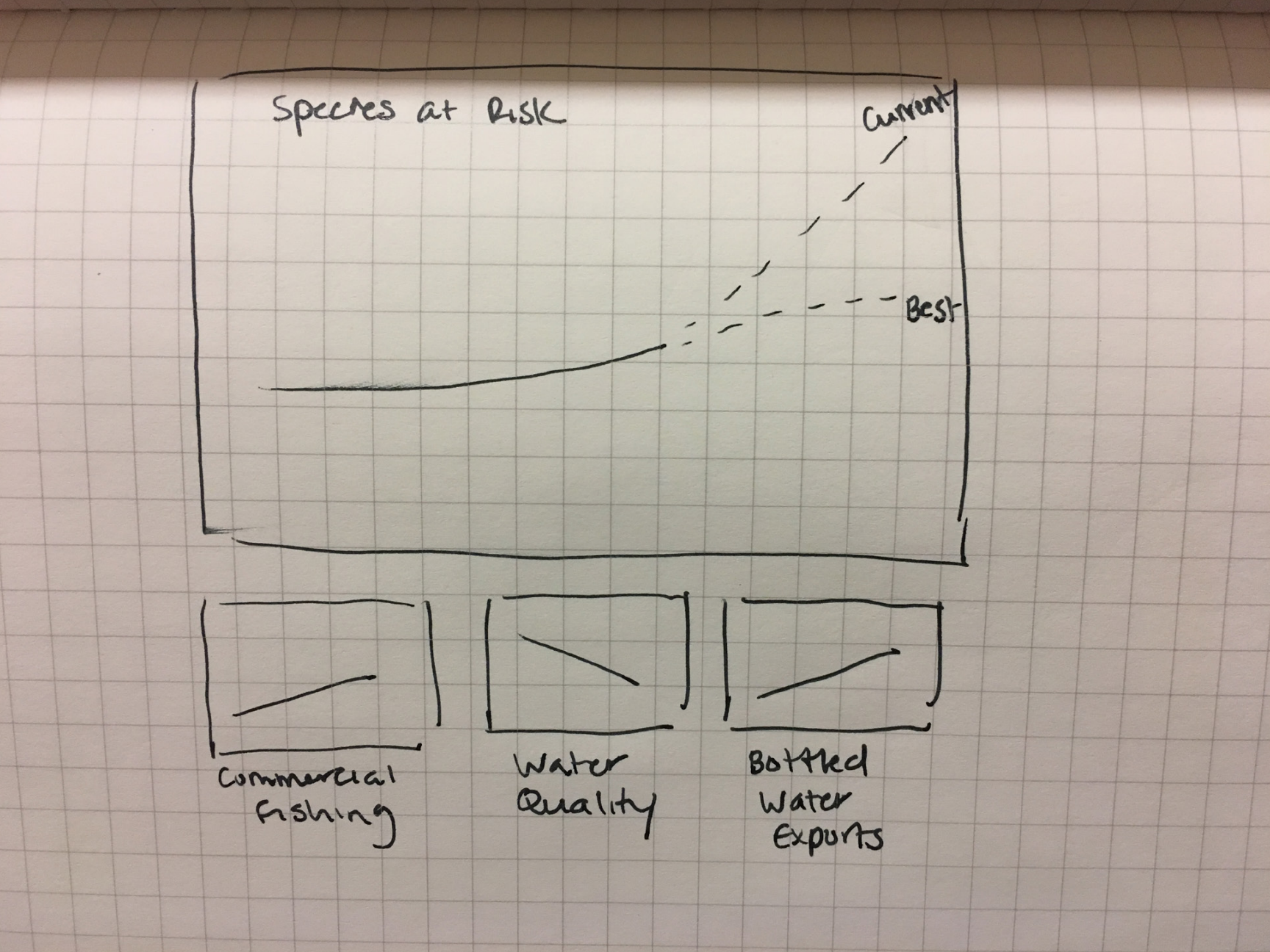
The Fifth (And Final!) Iteration
Animation
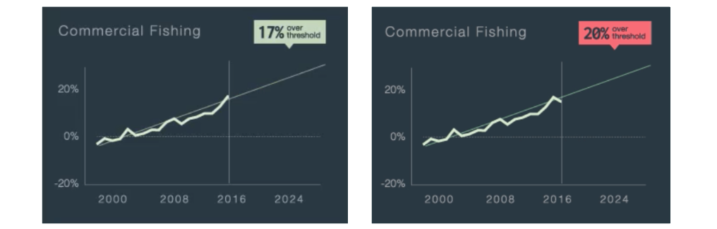
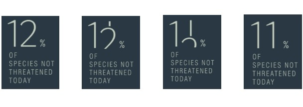
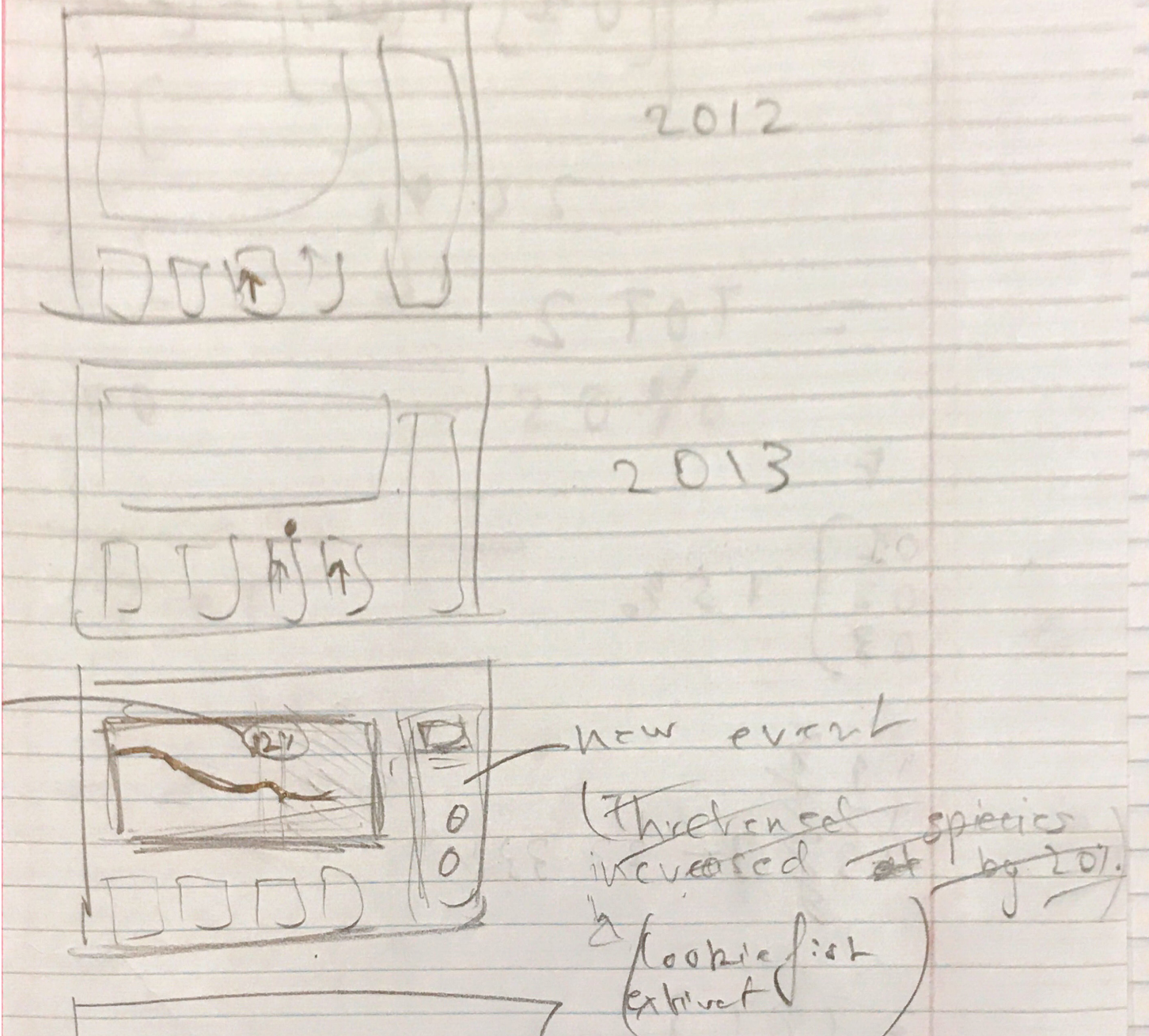
Although dashboards are single screen displays, the visuals change dynamically as information is updated. Given this nature of dashboards, we animated the visualizations to reflect the constant change of time as well as drawing users’ attention to critically important, new information. In order to illustrate multiple events without overwhelming the user’s attention, we animated current, relevant news stories that would rotate (like a slideshow with captions) and show just one at a time. New events would be added as they occurred, while older, no longer relevant ones would be rotated out. The screen caps below illustrate the change from one event to the next, from left to right.
To illustrate the change or passing of time, graphs would shift in such a way that more of the trend line would be visible or the most recent data point would become part of the actual line chart as opposed to just a projected trend point. This can be seen in the screen caps above, from left to right.
A notification would also pop up in the case that a threshold had been crossed on a chart (seen in left screen cap above, top right of the image). If new data were to be released, however, and the threshold reached an even more severe, critical point, the notification would update to reflect the new data in addition to change color to gently alert the user of an abnormality (right screen cap above, top right of the image). Since the numbers are fairly small, a gentle fading animation seemed appropriate for this change in visuals.
FINAL THOUGHTS
We hope to see our design providing value to stakeholders in the following ways.
For scientists, they are able to:
Communicate scientific research and data as guidance for action
Create value from trends and projections
Preserve NZ’s native freshwater biodiversity
For policy makers, they are able to:
Validate the impact of their policies
Identify opportunities to act before significant losses occur
Create better future policies